


How eCommerce Design Impacts SEO
What comes to mind when you think of SEO?
For most it’s probably technical issues, keywords, or content. Yet, I’d argue one of the most important stages in our work is heavily connected to design. Especially within e-commerce.
Let me explain why.
SEO = Navigation Optimization
Search engine optimization (SEO) is a fancy way of referring to improvements made to a website or webpage to improve visibility within search engines.
But if you think about it, search is simply a form of navigation. This navigation just happens to extend past your website.
When someone searches for a “brown leather sofa”, this is the equivalent of them navigating to this category through a navigation menu or faceted navigation. The difference is the ease at which they’re able to do so, especially across the entire web.
For this to be effective though, you need to have these categories in place.
We call these “entry points”, and it’s as simple as dividing up all of your products, establishing the different search terms they’d use to find them, then creating different product categories for each of these.
By having these categories in place and easily accessible via a user-friendly design, they’ll perform better in search visibility.
You’ll also likely gain from higher e-commerce conversion rates as navigating through your products will be both faster and easier.
Let me show you how this translates into different elements of design:
Navigational Design
There are 5 core elements of navigation influenced by design that are strongly connected to your SEO performance.
1. Main Menu
This is the main point of navigating through your website. It’s critical for both user experience and SEO.
You’ve got the option here of having a few different core collection links, a shop mega menu, shop by menus, or a combination of all of these.
The key consideration here is how accessible your various collections will be.
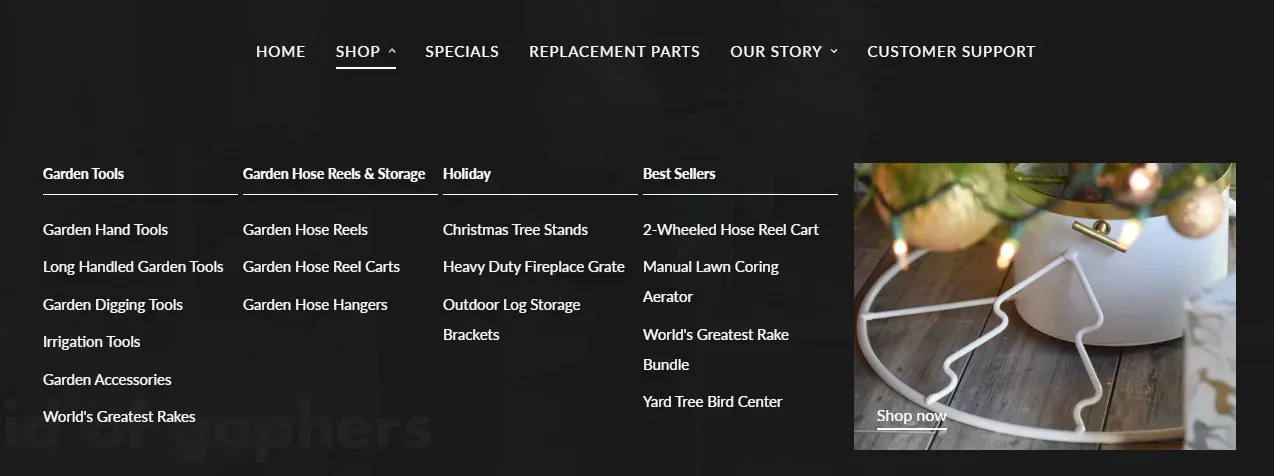
For small stores, a simple shop menu may be sufficient, YardButler are an example of this:
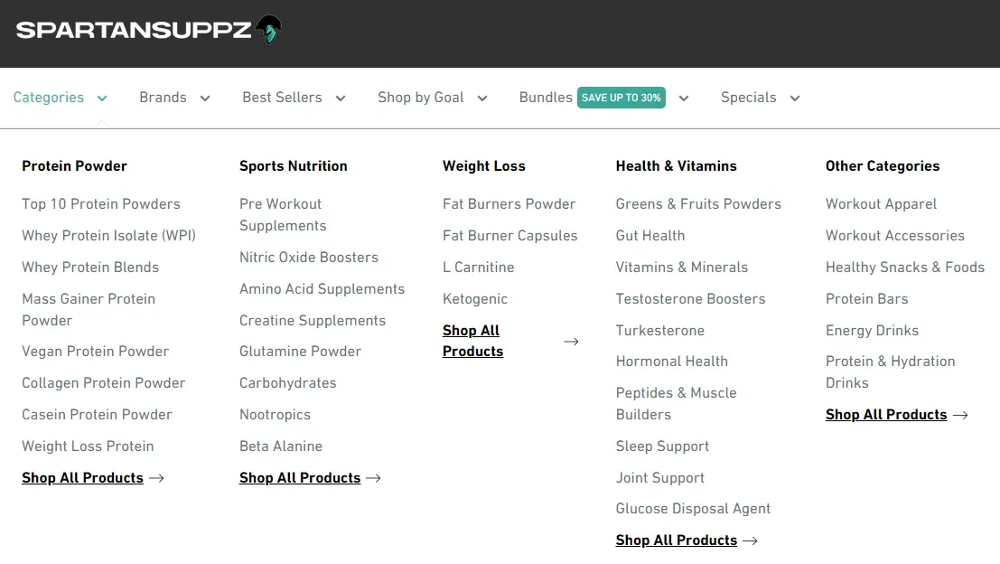
But what if you’ve got a huge product range? A supplement store, for example. There’s protein supplements, pre-workouts, and amino acids, etc. Then half a dozen categories within each of these.
Is it user-friendly to force a user to click the protein supplements link, load the page, then have the option to select vegan protein? Not at all, these should be accessible via the menu.
SpartanSuppz offer these various options through a “Categories” menu:
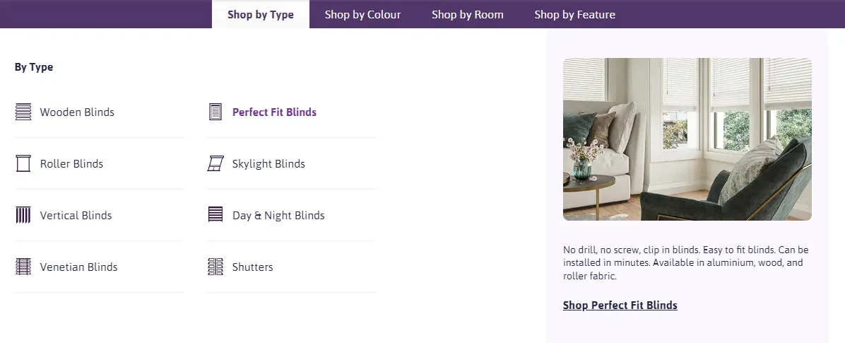
And then you can get even more complicated than that. Maybe you have different brand collections, room collections, style collections, goal collections, etc.
We call this a “Shop by” navigation.
Here’s an example for a window blinds company:
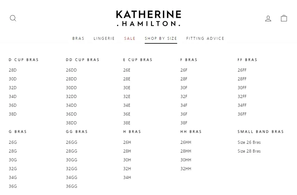
Or a unique “Shop by Size” navigation used by luxury lingerie brand Katherine Hamilton:
Each of these ideas presents an improved user experience by simplifying the navigational experience. No opening multiple pages, filtering down options, and endless clicking. Just one-click straight from the main-menu, available on every page.
Thinking this way not only leads to better SEO by simply having the pages in place, which expands your brand’s keyword potential. It also performs better by surfacing these pages, the easier they are to navigate (i.e. less clicks), the better they’ll perform.
It’s a true win-win. Don’t overlook your main menu.
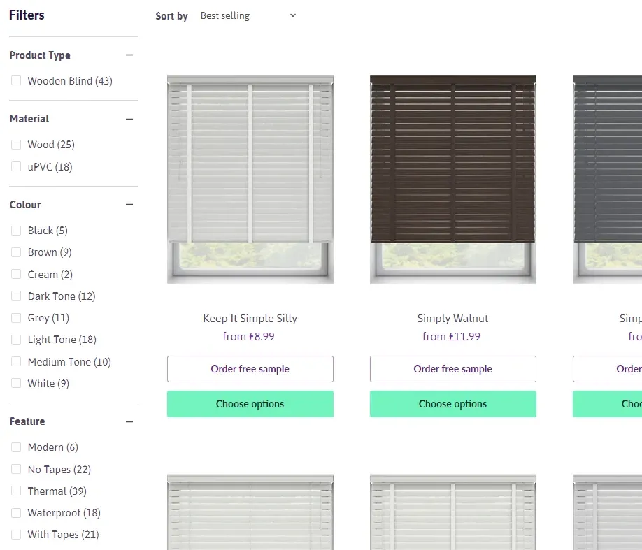
2. Faceted Navigation
Faceted Navigation is the sidebar containing filters that displays beside your product grid. It’s a core part of the e-commerce shopping experience, but most brands don’t recognise how detrimental it can be to SEO when managed poorly.
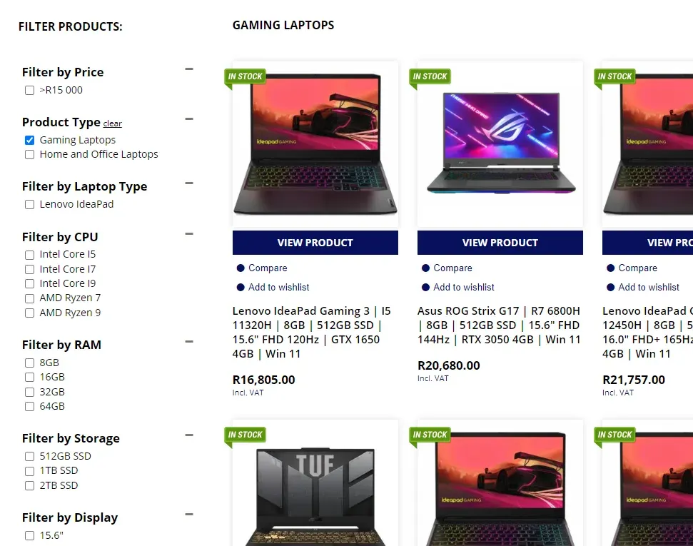
Here’s an example from an online computer store:
The user benefits of this are clear, if you have a wide product range with various differences, it’s incredibly helpful to quickly filter these down.
However, different ecommerce platforms and apps handle these at various degrees of detriment to SEO.
Certain WooCommerce plugins will handle this by creating a unique product category page for every filter applied:
This can be highly beneficial to SEO, but without significant management will likely lead to a huge number of duplicate categories, low quality / unsearched categories, and an all-round mess.
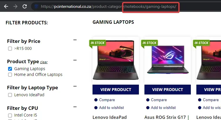
Another flawed but simpler configuration is implemented by default on Shopify stores. Shopify 2.0 themes use filter parameters and optional meta fields to control the faceted navigation.
Example from Blindstyle:
This creates less overall headache, but it does mean none of these options are indexable pages. Therefore if you’d like to rank for any of these topics as keywords, you’ll need to manually create a collection for them.
Overall it’s worth considering if you need faceted navigation, what options to display if so, and how this will impact SEO in your specific use case.
3. Subcategory Filtering
One navigational element I find commonly under-utilised is sub-category links. Especially in a visual, swatch-like manner.
A perfect example of this is Chewy.com:
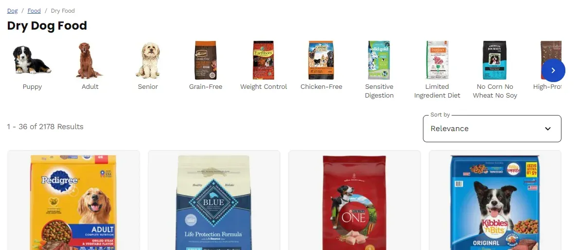
On top of their faceted navigation, they’ve also got these visual subcategory links to further filter down this category of Dry Dog Food.
MyProtein have a similar functionality for cross-linking relevant product categories:
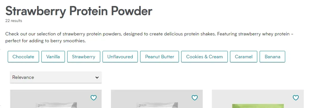
From a user perspective, these links allow quick navigation to popular categories of relevance and likely of interest to the page they’re reading. This is easier than finding options across 50-100+ filters.
From an SEO perspective, these links show search engines the topical relevance between these different categories, and reduce the number of clicks to access them which is another strong ranking factor.
This can also be implemented at the bottom of the page as Travis Perkins are doing:
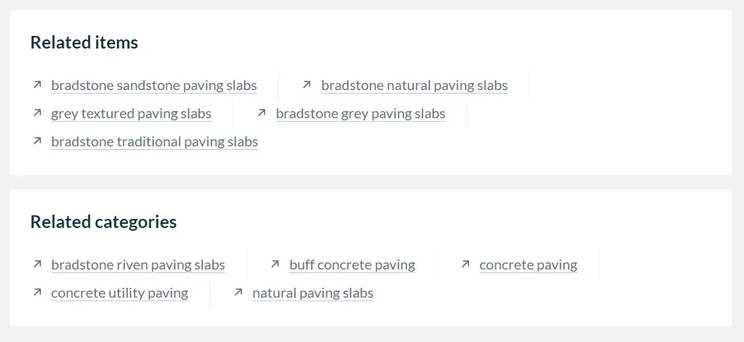
Though, this is usually reserved for less relevant and user-friendly links such as popular products, brands, or highly specific searches/categories.
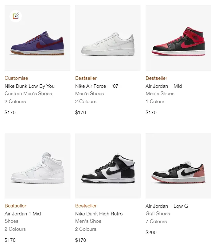
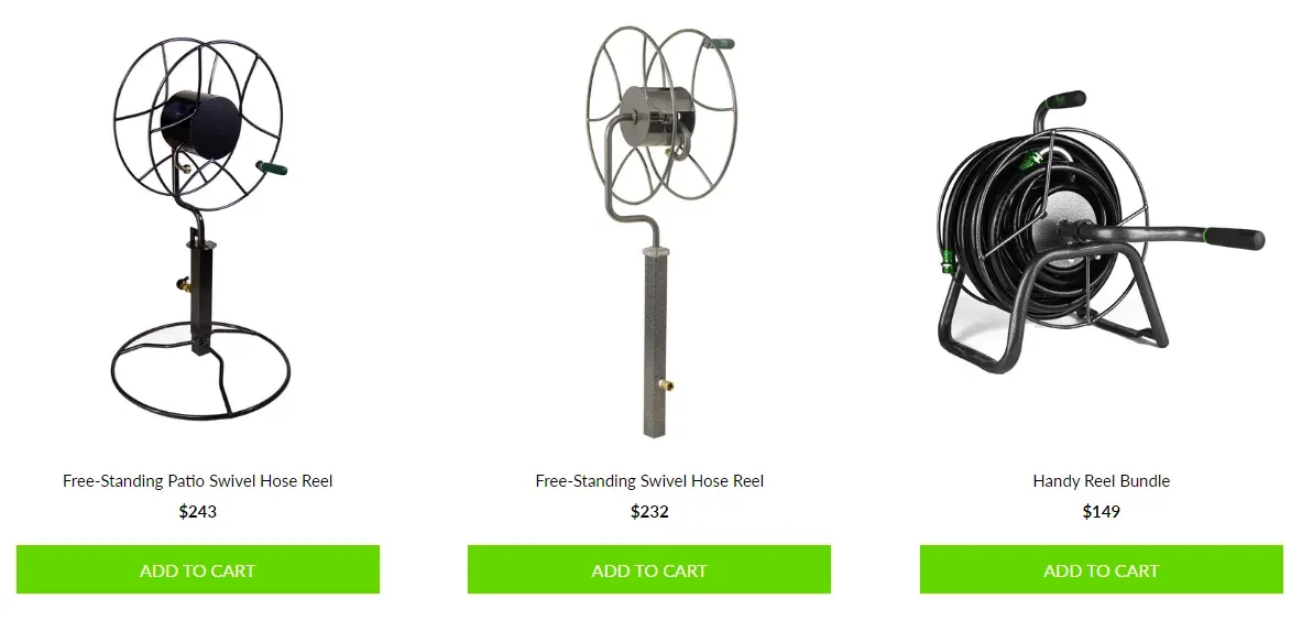
4. Product Grids
As an ecommerce brand, you’re likely familiar with what a product grid is:
But have you ever considered its impact on search rankings?
There’s 3 SEO considerations you’ve likely overlooked here:
4.1. JavaScript disabled viewing
Have you tested accessing your product grid without JavaScript enabled? Most ecommerce platforms default to working without JavaScript, but many popular apps don’t.
With JS disabled, many apps will display a never-ending loading animation, or in this case, an empty page.
This is of little concern for the end-user experience, rarely do users disable JS.
But it is a concern for having search engines crawl this product grid. See, search engines can crawl JavaScript these days, they just don’t do it as well and if possible shouldn’t be relied on.
Now if you’re in this position, it isn’t mission critical. Your products are likely being crawled OK. But I’d urge you to move to a non-JS reliant solution when you have the chance for best practice.
4.2. Number of products shown
At Logeix we’ve tested this numerous times, more content on a product category page leads to better rankings in the vast majority of cases.
This can mean category descriptions, but it also refers to the number of products shown on the page.
From a user perspective, the amount of products displayed in the grid is far more important than the description depth. Showing more products allows simpler navigation without using pagination or filtering.
It also reduces the amount of pagination, taking a product from being buried 36 pages deep to half of that is a win for your SEO. Better yet, have them on the first page of a subcategory so they’re only 2 pages deep.
In short, expand the number of products shown in your grid. Just be sure to use lazy-loading, you don’t want 36 product images loaded at one time.
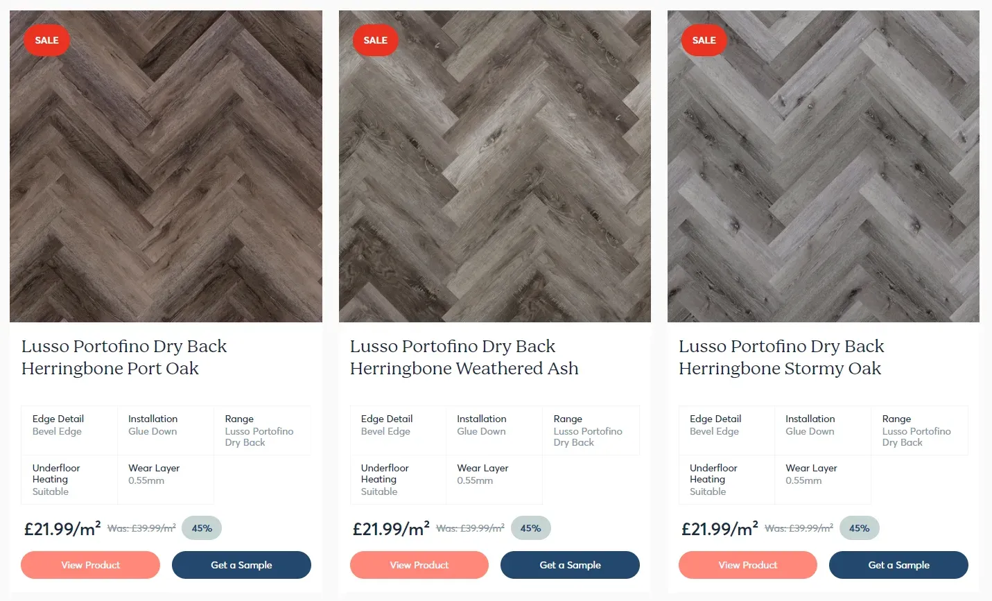
4.4. Product details
Most product grids look similar to this:
There’s nothing wrong with this, and in many cases that’s more than sufficient. But in certain cases it can be user friendly to display more than that.
Stories Flooring, for example, show a small table of product details:
HP show high level technical specifications:
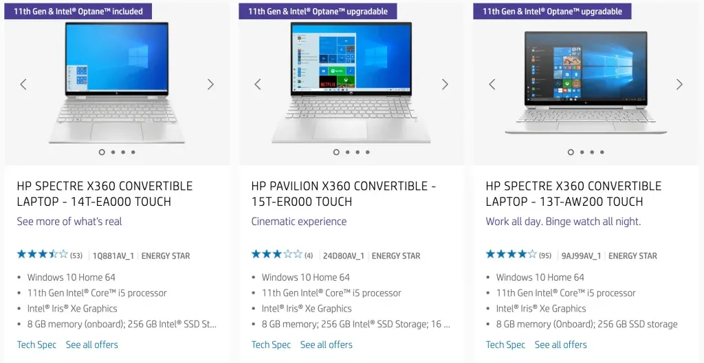
These additional product details can provide extra context without needing to apply filters or click into the product page. They’re also great for SEO as they’re expanding the page content.
5. Product Linking
Another highly under-utilised navigation point is from your product pages. Think about it, how many product pages do you have?
Our typical client has over a thousand products. Yet, rarely do they intentionally design navigational elements for these pages to benefit the user or search engines.
I’ll give you some examples.
5.1. Breadcrumbs
Breadcrumbs are a fantastic way to link to the primary category and hierarchical subcategories this product is part of. If your category has 149 products, that’s 149 internal links you’re missing not using this.
It’s also significantly easier for your customers to find more products similar to what they’re browsing.
See this example from Big Bertha Original:

No need to fiddle around with the main menu, just click “High Back Bean Bags” to jump right back to the most relevant category.
5.2. Tag style category links
If the primary category or subcategories aren’t what someone is looking for, you can also have a navigation element specifically for other collections this product is part of.
A simple example of this is ASN’s implementation:
But this can also extend into another “Shop By” style menu for an even more user-friendly approach.
OmniaFishing are a great example of this:
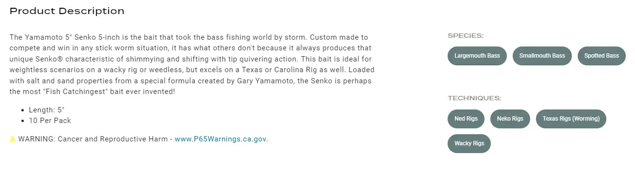
Each product is tagged with species it’s great for fishing, techniques it can be used with, etc. Then each of these are linked to the relevant categories for every product.
It’s beautifully user-friendly and creates thousands of internal links to categories across their wide product range.
5.3. Product variants
If you sell visually differentiated SKUs, it usually makes sense to list them as separate products rather than product variants. This allows quick visual selection from the product category pages, rather than the need to open each product first.
The downside is if you’re on the product page, it can make it challenging to navigate to the other colour or style options for comparison.
The solution to this case is product swatch links.
For example:
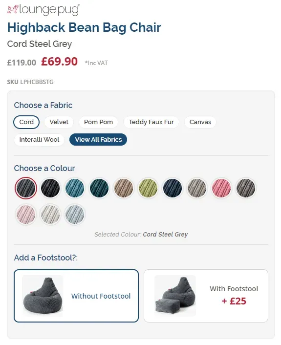
Each of these colour swatches links you across to the alternative product page. A simple, but helpful solution.
5.4. Related products
You’ve probably come across a related products section on other online stores:
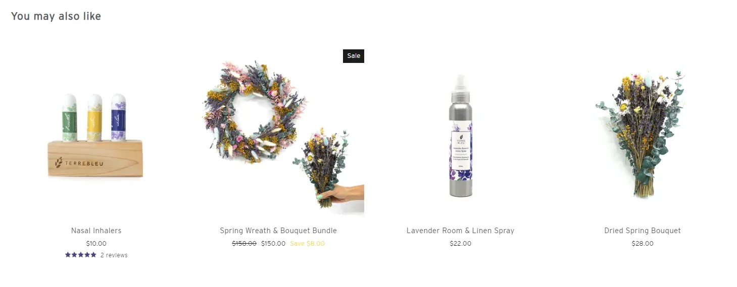
These are commonly used to increase average order value (AOV) and conversion rates, but shouldn’t be discounted as an SEO tactic.
By showcasing relevant products, you’re surfacing more internal links, which reduces the number of clicks to find pages and ultimately leads to better rankings.
User Experience (UX) Design
The previously listed opportunities focused on elements that have a direct influence on SEO performance, but it’s worth considering the indirect benefits also.
Conversion
By creating a stronger user experience, reducing the number of clicks, and creating an all-round more beautiful website - you’re very likely to increase conversion rates.
You don’t even need data to understand this point.
If someone visits your store looking to purchase chocolate protein powder. Do they have a higher likelihood of purchasing if they can find it within 2-clicks versus 4-clicks? Of course.
There’s also conversion on a click-through basis.
We’ve commonly found that having “Choose options” buttons on product grids creates a higher click-through rate than displaying no button at all. While marginal, this represents increased time on site, which we’ve found influences rankings.
Time on site
It’s also worth considering the detrimental effects of bad SEO on your user experience.
The most common issue I’ve encountered, which is a recipe for low time on site and high bounce rate (aka SEO killers) is spammy above the fold content.
Take a look at this tiles company:
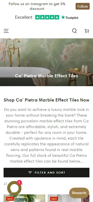
On a mobile device, their products are about a 3 finger scroll down the page. On a category page.
This sort of low quality content dominating the page will destroy your rankings, but it’ll also decimate your conversions. I’d urgently address this if you’re using this tactic. Detailed descriptions are no problem, but hide it behind a “read more” or careful page placement.
Final Thoughts
SEO and design are heavily interconnected. They’re each part of a system and treating them as separate points of optimization is a huge mistake.
Your SEO consultant should be involved in the user experience design decisions. Your designer should be involved in the internal linking decisions. Or better yet, work with an agency like Logeix that does both as part of a cohesive strategy.
But it does bring up an interesting point:
SEO isn’t just adding keywords to pages, that’s a tiny fraction of a great strategy. Effective SEO is a multi-disciplinary skill involving design, development, strategy, data analysis, content, and more.
Further Reading
if you’re interested in implementing some of these navigation optimization tactics, here’s some relevant guides: