How to Add Content to Shopify Collection Pages

Mobile device traffic for most Shopify stores is upwards of 50% of customers.
And there’s no better way to destroy mobile device sales than putting a gigantic block of text above your product grid.
Just like this:

So how do you add content for SEO… without damaging conversions?
Buckle up, let’s do another deep dive.
Why content is important for collection SEO
Content is one of the major keys of great SEO.
Within eCommerce, this primarily applies to collection descriptions and product page descriptions.
You can rank collections without descriptions. Especially if you have a strong brand.
But adding as little as a few hundred words that are conversion focused and SEO optimised, can significantly improve rankings - in our findings.
The problem with Shopify collection descriptions
But how do you add content without ruining the page layout and pushing all your products below the fold?
That’s the problem with Shopify.
By default, anything you add into that big description box appears right at the top of the page.
This is a recipe for damaged rankings.
Thankfully, there’s a few tricks to resolving this:
How to add longer content to collection pages
I’ve used 5 different techniques to resolve this issue, depending on the store. Each of them requires a small amount of development to utilise. Let’s cover them all.
Option 1: Move collection description to bottom of page
If you want a quick and easy solution, simply cut and paste the description to the bottom of the page. Fast and easy.
You can do that by editing your theme file.
You’ll need to find the section template for your collections, this may be called something like collection-template.liquid within the Sections folder of your theme.
Within the, you’ll be looking for the description part:
{{ collection.description }}
Then simply cut and paste this near the bottom, after pagination {%- endpaginate -%} would be great. (Make sure to select all HTML containers for this too e.g. collection-description)
Some themes also have functionality for this built in, so check your theme settings first.
Now the downside of this approach is it allows little flexibility, it’s at the top or bottom. And the bottom means there’s no sales driven content at the top, which can actually help sales sometimes.
Option 2: Split collection description
If you’d like a bit more flexibility, another option is to split the description so it displays at the top and bottom of the page.
Here’s an example of how you could do this:
Add
{{ collection.description | split: '<!-- split -->' | first }}where your normal {{ collection.description }} is, and
{{ collection.description | split: '<!-- split -->' | last }}near the bottom somewhere.
To use this, all you need to do is put <!-- split --> in your collection description (HTML) and it’ll split the content from that point.
This adds more flexibility and works great if the description is a few hundred words long, but more than that, it’ll still look ugly like a gigantic article is pasted to the bottom of the page.
Option 3: Use a read more link
Another option, ideal for shorter descriptions again, is to use a read more link to shorten descriptions at the top of the page.
Though, this could also be applied to the bottom of the page too.
You can do this by modifying your description to be something like this:
<div class="container">
  <span id="truncated"> {{ collection.description | truncatewords: 10, "Read More" }}</span>
  <span id="fullDescription" style="display: none"> {{ collection.description }} </span>
</div>
And then a little jQuery to activate the read more link:
<script>
    $(document).on("click", '#truncated', function () {
        $(this).fadeOut;
        $('#fullDescription').fadeIn();
    });
</script>
Option 4: Add an FAQ accordion
One of my favourite ways to add content to collections is through FAQ accordions. Simply answer a few frequently asked questions, hide it all in an accordion, and you’ve got user-friendly and visually beautiful content.
Now you can either implement this using option 2 above, then manually pasting code into the HTML editor of the collection description. Though, that’s a bit messy.
Or you can create some custom meta fields.
Create one for up to 6 questions and answers, that automatically add to the bottom of your page.
Mircea Piturca wrote a great example code you can reference for this.
Don’t forget to use FAQPage schema for potential rich snippets here.
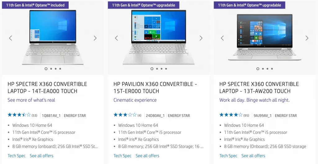
Option 5: Product specs and details
The final way you can implement this is to add product specs and details to your product grid.
This is the most complicated method, but I’d also argue the best.
Here’s an example of what I’m talking about:

You can utilise this for showing:
- Technical specifications
- Who’s it for / why they’d pick this
- Materials, colours, flavours, etc
- Advantages vs disadvantages
There’s a lot of potential here, but the basic idea is you don’t only provide a list of products, you provide details and context to help them select the right product.
As for implementing this, you’ll need to use custom metafields and have a developer help you. That’s a bit beyond the scope of this article.
Next Steps
That’s 5 ways you can add more content to your Shopify collections without creating a spammy low converting page.
Think carefully about which best suits your brand, products, and visitors. Then I’d recommend working with a developer to implement this, just to ensure it’s done right.

