


Shopify Footer Design: Everything You Need to Know
When designing an eCommerce website, the footer is often an overlooked aspect.
Despite its seemingly minor placement, the footer plays a crucial role in creating an impression and ultimately converting visitors into paying customers. It’s the yin to the header’s yang.
After reviewing the footer designs and conversion tactics of 100+ top-performing Shopify stores, here are our key findings.
What makes for a good Shopify footer design?
It comes down to a few main things:
Stick to one main CTA
It’s generally best to focus on one main call-to-action (CTA) in your footer. This could be a sign-up form, a featured product, or anything that may be beneficial to both your brand and your customers.
Make sure your CTA stands out by leveraging color and size contrast, action-oriented copy, and most importantly, sticking to one CTA. Having multiple CTAs can backfire and dilute the effectiveness of each one.
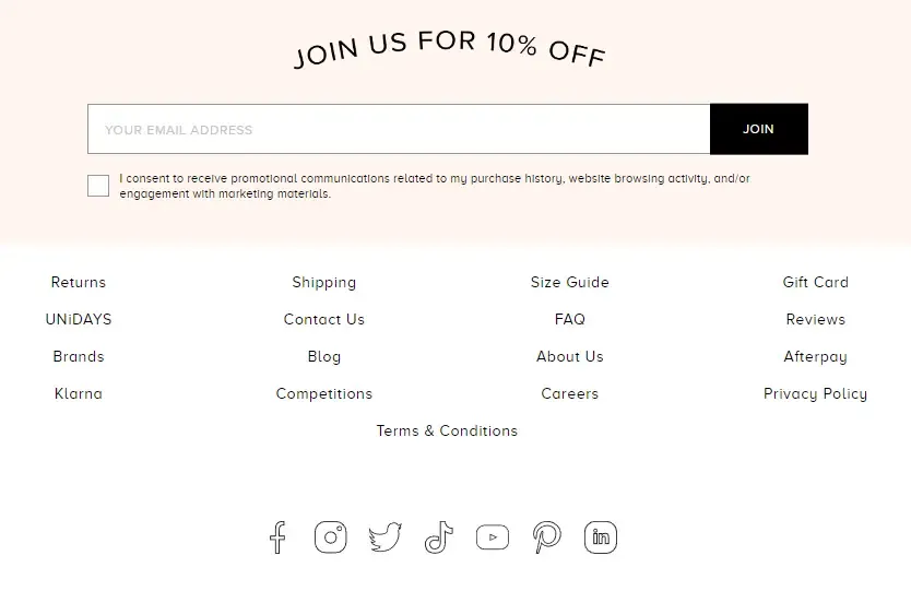
If you present too many options, you’re dissuading users from picking one at all:

This business crams three different actions into a tiny footer space, including a lengthy legal consent. Even with proper visual hierarchy, this won’t convert well.
Be aware of spacing
Make sure to leave plenty of white space between your different footer elements.
This store has already effectively grouped link categories, but link spacing leaves a bit to be desired, and do these legal links really deserve a place at the top?
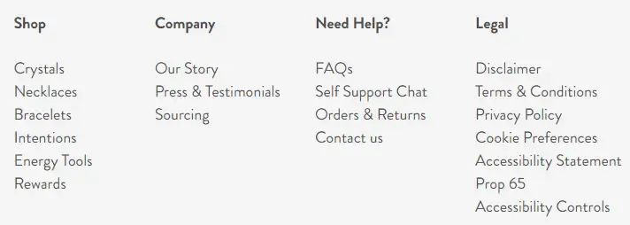
Prime opportunity for fat-fingering, oops.
Lashify provides a good example of effective spacing and hierarchy:
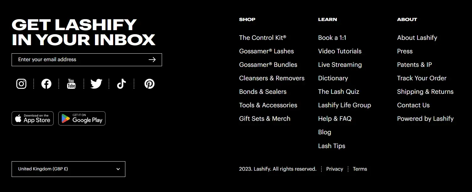
Notice how the good actionable stuff is reserved to its own little island on the right. They also did an immaculate job emphasizing their sign-up form. The social links, app install prompts and currency selector are all properly de-emphasized, so much that they don’t need their own subheadings.
They also chose to tuck away the 2 legal links down below and kept the three columns full of useful information, again a nice plus.
Keep it reasonable
The footer is a direct counterpart to the header navigation. But that doesn’t mean you should copy-and-paste whatever links are up there.
In the same vein, it’s a terrible idea to dump whatever technical or odd pages down here, at least not without giving them proper placement. (see previous section)
This menu employs a simple-to-understand structure, minus the 35 or so links that are definitely a nightmare to scroll through on mobile:
A principle in UX is that the average person can only hold around 7 ± 2 pieces of information in their working memory at once (Miller’s Law). This also plays with Hick’s Law, suggesting that more choices = more time spent coming to a decision.
Group related categories to distribute your content more effectively, and if that doesn’t keep your link count in check… you might want to reconsider your strategy.
Whatever you do, make sure you’re not sacrificing function for form. A good footer communicates just about the right amount of information and leaves a good last impression.
Contrast & accessibility
Contrast in design extends beyond color. It can also include size (bigger and bold subheadings), shape (clever use of rounded corners, different shapes placed next to each other) and even texture (the use of background images/patterns).
It’s the building blocks to create visual interest, hierarchy, and emphasis.
If your footer links are too small, unorganized or lack adequate styling, they won’t draw attention, let alone convert well.
Lighthearted beauty/apparel brands are usually a huge offender of this:
Their little sign-up form is superb, but the links below are placed with no discernible categorization. They’re also admittedly uninteresting to look at.
This 15% discount on another store, while great, is also hampered by non-existent color contrast:

Contrast is a big component of accessibility i.e. designing websites that can accommodate everyone, including people with disabilities. Make sure your color and typography options are in accordance with the Web Content Accessibility Guidelines (WCAG), which all official Shopify themes follow.
Another minor accessibility mistake in footer design (or anywhere really) is using text on images like this:

It’s definitely easier to just use an image compared to coding up a proper HTML structure. But it comes with several downsides:
- Text on images looks bad compressed
- Graphics are usually not made with mobile devices in mind so they end up hard to read
- You waste precious content because search engines can’t read it
- Screen readers won’t recognize bitmap text
The best way to deal with bitmap text on images is to avoid using it whenever possible. If you must rely on it, provide an alternative text description.
We have an entire article dedicated to Shopify image optimization, check it out!
What you should include in your Shopify footer design
Now that we’ve covered the principles, here’s a few things that top-performing Shopify stores are including in their footer design.
Keep in mind that these are individually great additions, but not all will add value to your website, especially if you try to go for too many. You risk making it hard for visitors to find what they need or even putting them off the section in the first place.
Business information
This might be obvious, but some stores actually lack information about their business, whether it’s physical address or a support email.
In addition to the obvious trust and credibility benefits, this can actually improve your SEO through the use of rich snippets schema.
Here’s a simple implementation from apparel brand Unique Vintage:
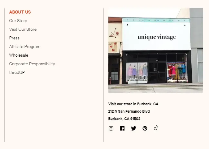
The good news is that this can be configured in your theme options, including social media icons. If you have many physical stores, include a link to your store locator page here (usually made with an app).
Sitemap
While sitemaps don’t get many pageviews, they’re useful for someone who might be looking for something extremely specific. And the moment they find what they’re after, they become easy to convert.

It’s also very simple to code up an HTML sitemap, so we’re looking at a slight benefit for not much effort. Shopify automatically generates an XML sitemap for you, but if you’d like to update it, here’s our guide to Shopify XML sitemaps.
Trust signals
These include security badges, industry awards, and other signals that indicate the website is safe and trustworthy to shop on.
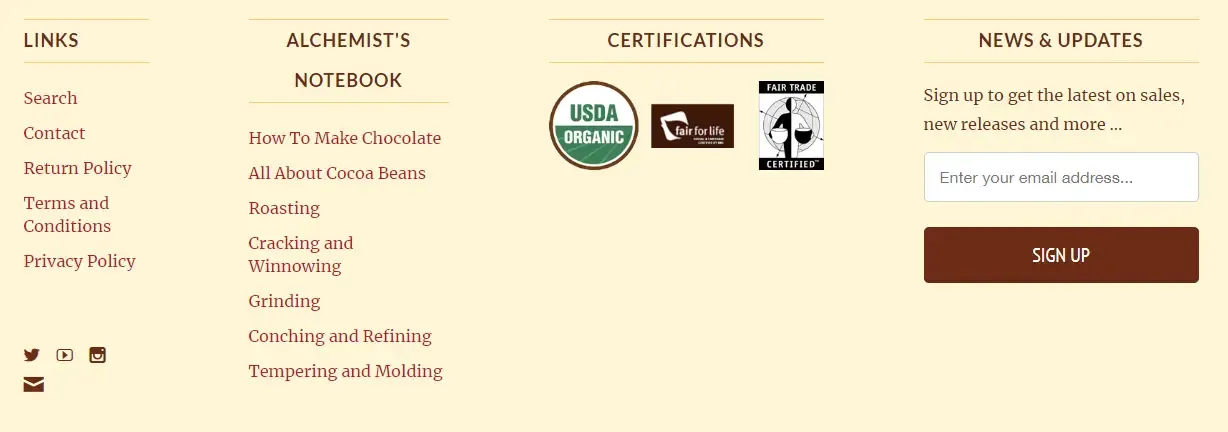
If your chocolate product business is founded on organic and fair trade principles, certifications are a great way to back your claims up:
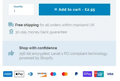
Another important trust signal you can include in your footer is secure checkout/supported payment methods:

The great news is that they already come by default with virtually all Shopify themes and can be enabled in your options. They look like this:

If you can handle some light development work, we actually recommend also putting them below your “Add to cart” button to improve conversions, but the footer will do.
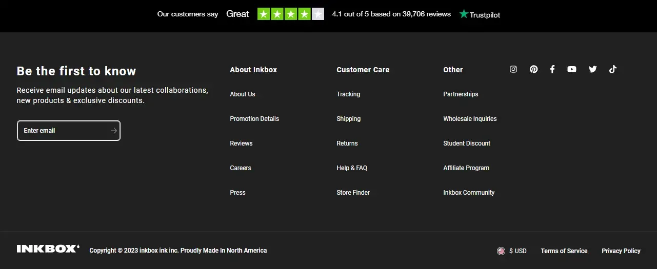
Trustpilot scores or customer reviews are also mighty helpful. These don’t have to go in the bottom area, many stores choose to display them on every page right before the footer:
Featured products
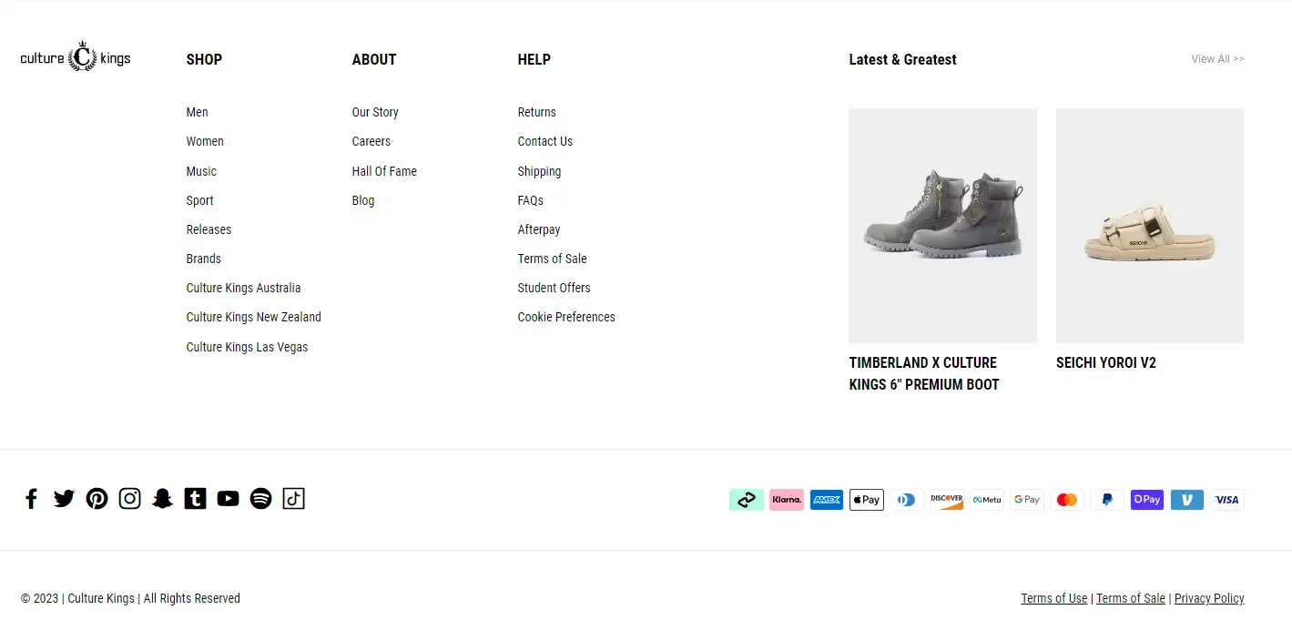
If you run a boutique store with low product count, showcase several key products/collections in your footer space as a last effort to keep buyers around.
Make sure you consider mobile layout, and don’t clutter up your footer space too much. Here’s a great example from Culture Kings:
Legal disclaimers
Most commonly seen on supplements or health stores where they’re a must. Including legal disclaimers in your Shopify footer is important to protect your business from liability and to comply with legal requirements.
Legal disclaimers can also provide important information to customers about the limitations of your products or services and can help manage their expectations.

Testimonials
If you have received recognition from a popular publication, congratulations! Similar to reviews, showing a list of websites/magazines your products were featured on is a huge confidence boost.
Beauty retailed Miss A pulled out all the stops and went with an animated carousel for their testimonials:

Sign-up forms
Including a sign-up form in your Shopify footer design is an easy way to grow your email list and customer engagement. Offering a first order discount or promo codes as an incentive for signing up can help encourage visitors to take action and become customers.
Of course, be sure to apply design principles to make it prominent in the footer. Use clear language and a compelling offer to persuade visitors into signing up.
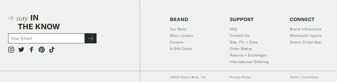
The default sign-up form available on Shopify is usable, but good design and copywriting go a long way, courtesy of Goorin Bros.:
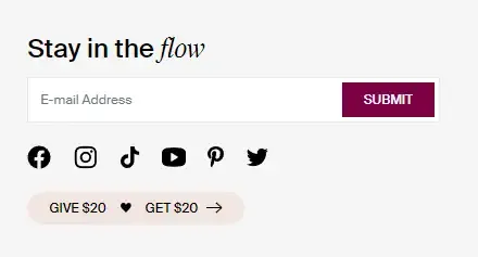
Similarly, Knix offer a subtle but creative way to push people to their referral program:
Benefits icons
Instead of lengthy copywriting, reinforce the value proposition of your business with brief keywords accompanied by an icon.
We recommend limiting them to 4 max, and keep vertical space to a minimum. On mobile, turn them into a swipeable slider so you don’t introduce too much scrolling fatigue.
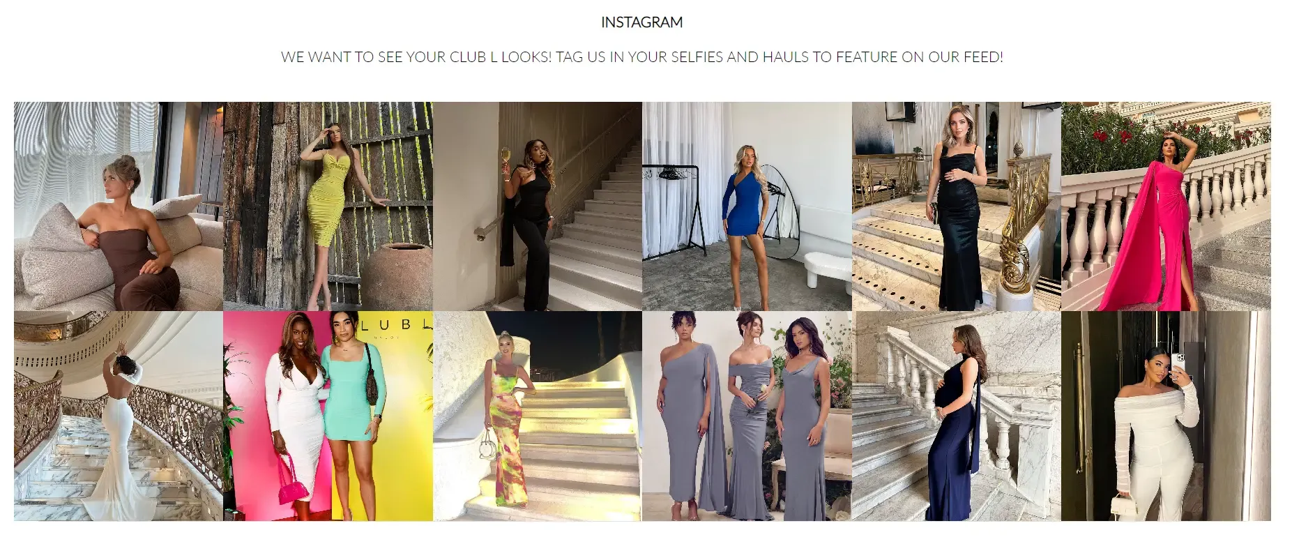
Social proof
Another huge opportunity for clothing brands, social proof like TikTok or Instagram grids near your footer space provides a (mostly) unfiltered view of your products in real life.
By showcasing real-life examples of satisfied customers, you can easily tell visitors that your store is “the real deal”.
We’ve seen examples of stores displaying a feed of their own marketing account’s latest posts. Some even go further and curate posts from real buyer accounts (presumably with permission).
Like other suggestions, this does not have to go directly in the footer. Put it somewhere near the bottom of your key pages to boost conversions, increase engagement, and establish your brand.
Examples of good Shopify footer design
Here’s some inspiration that makes designing the perfect footer for your store a little bit easier:
Follow your concept
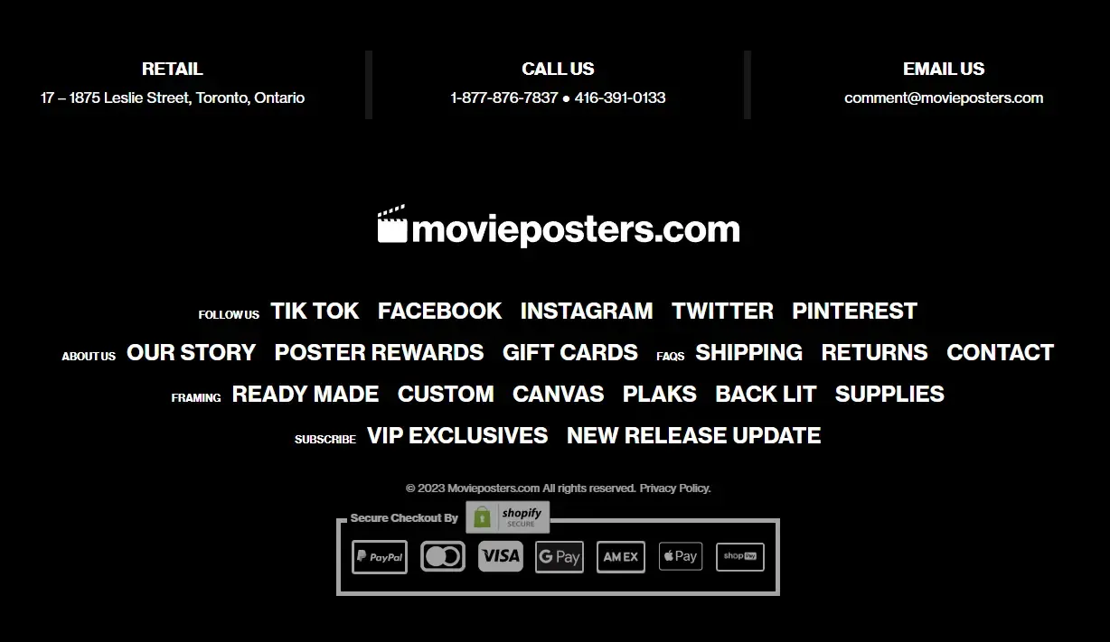
The cinema enjoyers at movieposters.com designed their footer to mimic an actual movie poster’s billing block. Note the all caps typography, small titles and the horizontal format.
A similar concept for your own niche is probably not immediately obvious, but you’re not limited to the way you place the links. Think color scheme, graphics, language too:
- An online bookstore turning the footer into a bookshelf, with each menu item styled as a book spine
- An arts and crafts store designing its footer to mimic a graph paper texture, using a handwritten typeface for links and lighthearted sketch graphics
By building a footer (or any type of user interface for that matter) unique to your own niche, you can draw in substantially more attention and thus conversions.
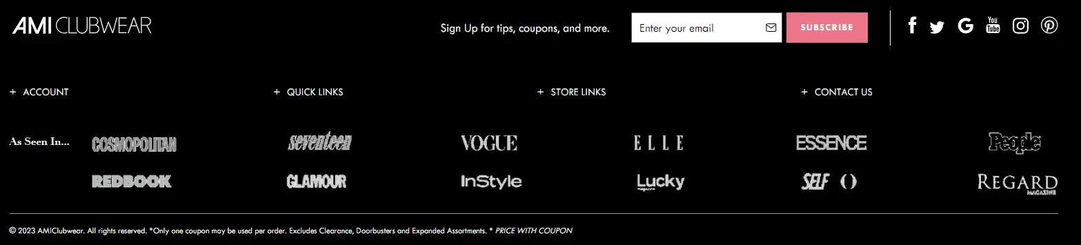
Shift the focus
Instead of using the footer as a means of navigation, AMIClubwear repurposed theirs to show off the many popular fashion magazines on which they’ve been featured.
Do note that they didn’t completely remove menu links, but opted to hide them behind a dropdown menu instead, which makes perfect sense in this context.
Use custom graphics
Popular Japanese entertainment brand Sanrio has created many, many beloved characters. If you happen to scroll to the bottom of their online store, you’ll be greeted by them all!
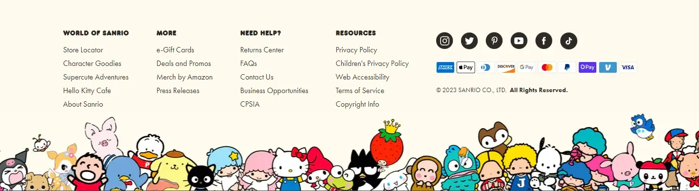
This approach is common among toy or apparel brands with a mascot, but we’ve also seen other businesses getting creative with graphics to highlight their CTA.
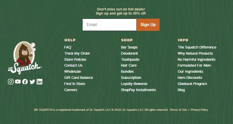
Texture & patterns
As mentioned above, texture contrast is a great way to highlight an element. If designing a mascot or making custom graphics isn’t for you, background patterns and gradients can achieve a similar degree of emphasis.
See how natural personal care brand Dr. Squatch leveraged this to cap off their already amazing website:
The uber-clean approach
Negative Underwear pride themselves on their minimalist-but-functional web design philosophy with little eye candy.
Even their footer copy and links are condensed and to the point:
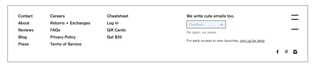
This won’t work as well if the rest of your website is busier though. Your footer design should stand out, but also be consistent with your overall visual language.
The classic layout
You don’t need a completely original footer to make things work. In fact, we recommend playing around your existing options.
This computer hardware distributor deviated little from what their theme offers, but maintained a great navigation experience with clearly defined link groups and store benefits:
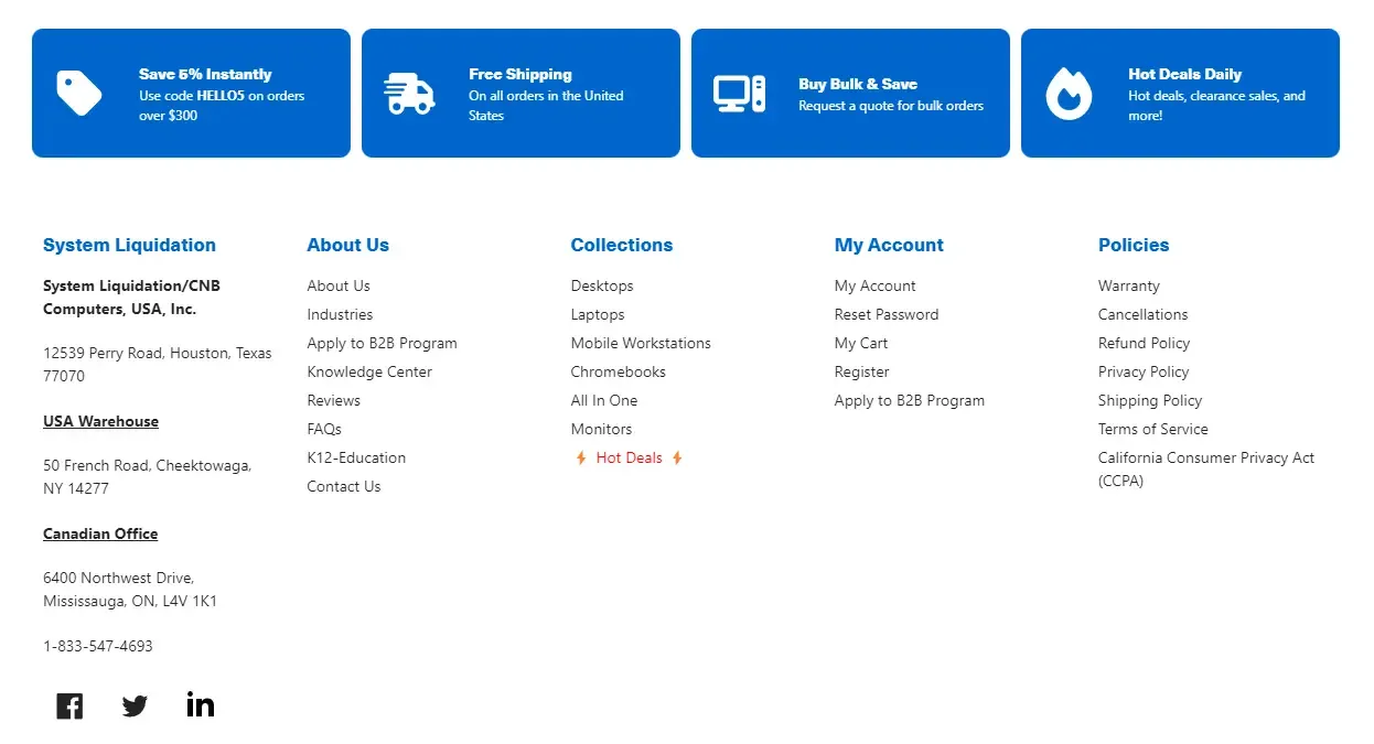
“If it ain’t broke, don’t fix it” in its truest form.
It’s pleasing to the eye, conveys the right information, and knows what buyers are looking for.
Frequently asked questions
What is the purpose of a footer in Shopify?
It provides the necessary information about your business, such as your contact information & your social media accounts. It’s also the last place you can feature a call-to-action (CTA) that can convert visitors into customers.
From a navigational perspective, it’s where you can link to important pages like FAQs, returns policy, and shipping information.
How can I edit my footer in Shopify?
To edit your footer, go to your Shopify admin, click on “Online Store” and then “Themes”. Select your theme and click on “Customize”. From there, choose your footer element and you can edit it within your theme provider’s options.
To make the best use of your footer space, many recommendations are gated behind custom code, so your best bet is to get in touch with your developer.
How can I optimize my Shopify footer design?
Some best practices for optimizing your Shopify footer include keeping it simple and easy to navigate & using clear and concise language. You should also place important links such as your contact information, shipping and returns policies, and social media profiles
Be aware not to overdo it and dilute your footer’s effectiveness. Treat it as a menu, not as a dictionary.
Can I add custom code to my Shopify footer?
Yes! Like every other theme component, you can add custom code blocks to your Shopify footer. However, if you want to modify current behavior, you have to do it through Shopify’s theme code editor.
If you’re not familiar with Liquid, contact a developer.
Can I use images in my Shopify footer design?
Yes, you can use images, but be sure to optimize them for web use so that they don’t slow down your website. Also, make sure you follow accessibility guidelines and avoid using text on images whenever possible.
Conclusion
That wraps up probably too many hours spent researching online store navigation.
We hope you enjoyed this and found some inspiration. Shopify navigation optimization is a huge topic that can’t be covered in one article, here’s some further reading if you’re interested: